GrantStation
Modernizing a legacy platform for the next generation of grantseekers.
Background
GrantStation is a funding intelligence platform that helps nonprofit organizations identify and secure grant opportunities. Beyond its database of funding sources, the platform offers planning tools, proposal guidance, and educational resources that support organizations throughout the grant-seeking process. For users navigating a complex and competitive funding landscape, the platform’s value depends not only on the depth of its data, but on how clearly that value is communicated and how easily users move from interest to action.
GrantStation is a funding intelligence platform that helps nonprofit organizations identify and secure grant opportunities. Beyond its database of funding sources, the platform offers planning tools, proposal guidance, and educational resources that support organizations throughout the grant-seeking process. For users navigating a complex and competitive funding landscape, the platform’s value depends not only on the depth of its data, but on how clearly that value is communicated and how easily users move from interest to action.
Challenge
Over time, that clarity eroded. The platform evolved through incremental updates, resulting in a fragmented experience where both the product and its value proposition were difficult to understand. Key benefits were not clearly articulated, and conversion pathways lacked focus. At the same time, the experience was heavily search-driven, with dense taxonomy and inconsistent navigation making it difficult to discover relevant opportunities. South Lane was brought in to rethink how the platform should present itself and operate, leading to a repositioning of the brand, a restructuring of messaging and conversion flows, and a redesign of navigation, search, content model, and design system.
Over time, that clarity eroded. The platform evolved through incremental updates, resulting in a fragmented experience where both the product and its value proposition were difficult to understand. Key benefits were not clearly articulated, and conversion pathways lacked focus. At the same time, the experience was heavily search-driven, with dense taxonomy and inconsistent navigation making it difficult to discover relevant opportunities. South Lane was brought in to rethink how the platform should present itself and operate, leading to a repositioning of the brand, a restructuring of messaging and conversion flows, and a redesign of navigation, search, content model, and design system.
Result
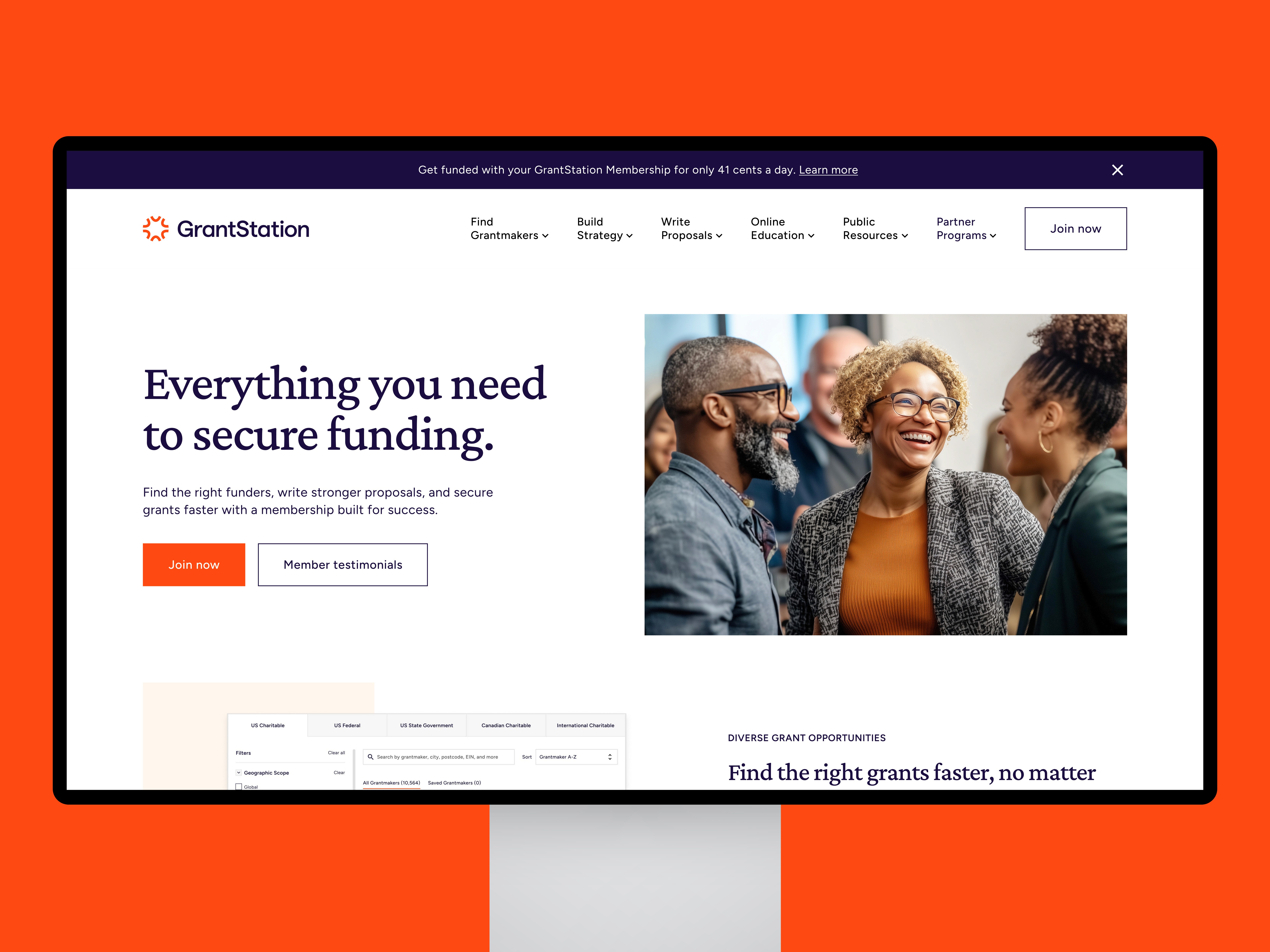
The platform now presents a clearer, more conversion-focused experience. The value proposition is expressed more directly across key entry points, making it immediately clear how the platform supports funding success. Conversion pathways have been simplified to guide users from exploration to membership, while the underlying product experience has been restructured to reduce friction in discovery through improved navigation, hierarchy, and search. Together, these changes reposition GrantStation as a more accessible, credible solution, strengthening both its ability to communicate value and support users in identifying and acting on funding opportunities.
The platform now presents a clearer, more conversion-focused experience. The value proposition is expressed more directly across key entry points, making it immediately clear how the platform supports funding success. Conversion pathways have been simplified to guide users from exploration to membership, while the underlying product experience has been restructured to reduce friction in discovery through improved navigation, hierarchy, and search. Together, these changes reposition GrantStation as a more accessible, credible solution, strengthening both its ability to communicate value and support users in identifying and acting on funding opportunities.


Related Work